For the past five years the extent of our “branding” has really been that we had this logo:

And we used an awful lot of this colour: Outside of that, the branding itself hasn’t really been too cohesive.
No consistent use of colours.
No consistent use of fonts.
Not much of a story behind the brand itself.
We’ve rolled with the same logo that was thrown together in 24 hours by an outsourced design company when we started the business.
With Local Digital having grown so much over the past few years, and notching up our fifth birthday recently, we felt the time was right to put on our “big kid pants” as a company and refresh the brand.
And so we present, the next iteration of the Local Digital brand, starting with the new logo:
The new Local Digtial logo is built from traditional and modern design parts.
The base font is a take on the geometirc sans genre. The sharp elegant cuts to bevel specific edges defines its contemporary look, making it visually impactful when married with our fresh colour palette and friendly brand typeface.
There is movement in the letters to create a memorable experience and to stand head and shoulders above the crowd.
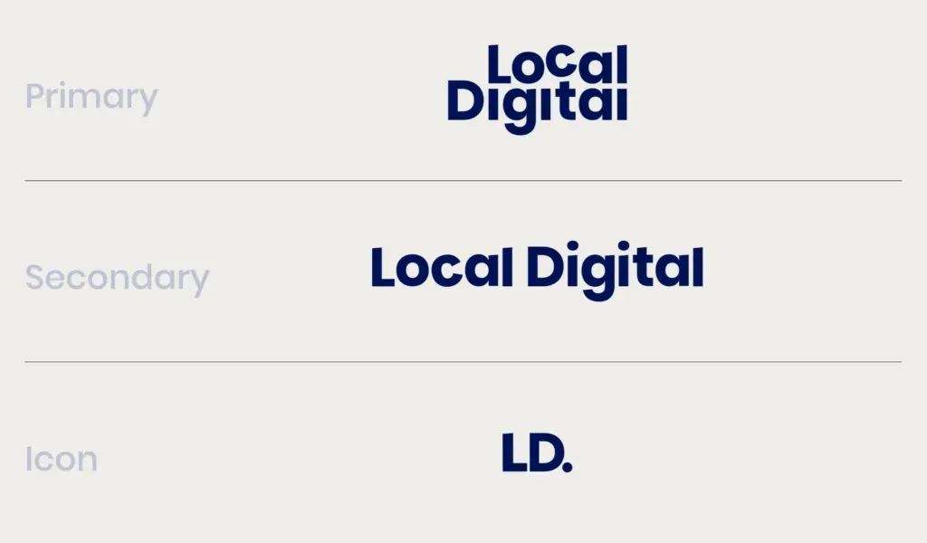
We have a primary, secondary and icon form of the logo, which can be displayed in any combination of our colour palette:
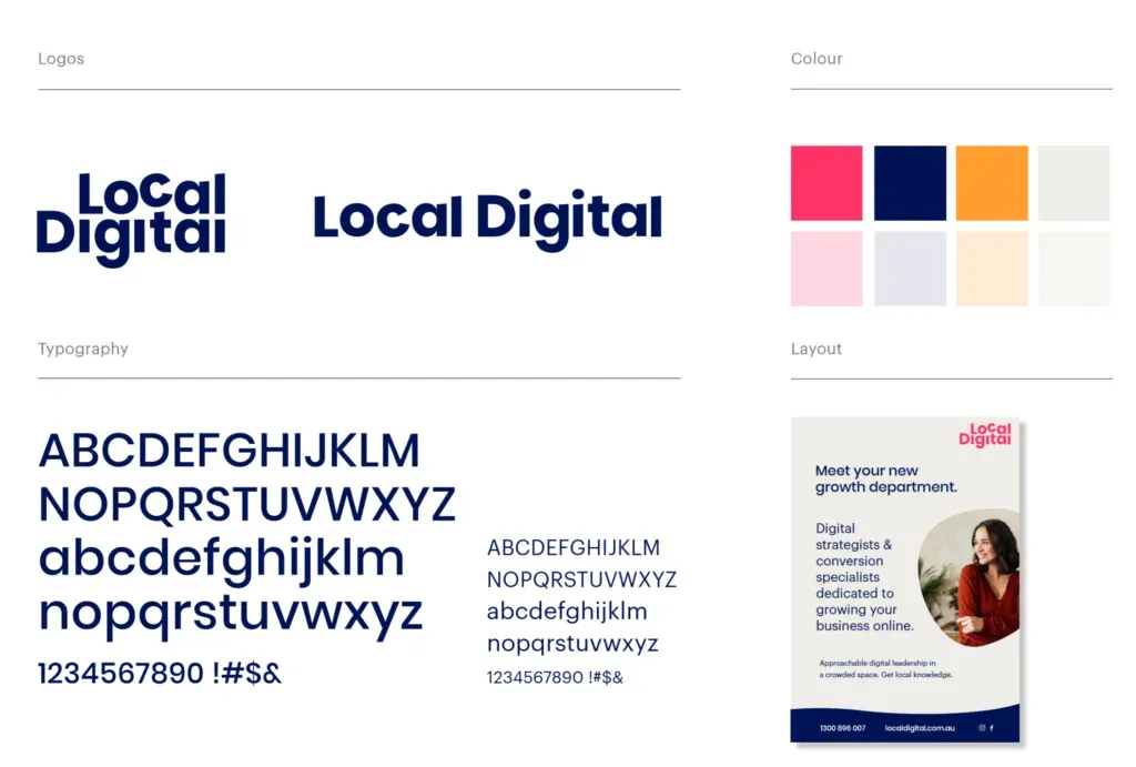
But, of course, a brand is more than just a logo.
It’s a supporting colour palette, typography, art direction and style guide like this:
Just as important as all of that is the story behind the brand.
The vision and the values and all that jazz.
We settled on the following:
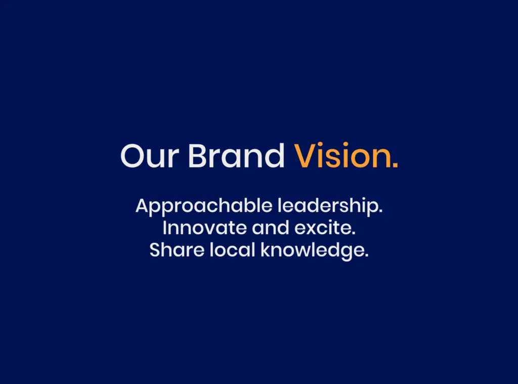
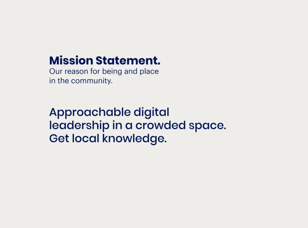
A big part of the new brand is framing what the word “local” really means to us.
In our world, it doesn’t mean we focus on local businesses or local marketing campaigns.
Rather, at Local Digital the word local means we’re so familiar with digital marketing that we know all the ins and outs, all the little tricks, all the “off the beaten path” ways to achieve awesome results like any true local would.
Just like a local to Sydney knows the backstreets or best eating spots like the back of their hand, we are digital locals that know how to grow businesses with digital advertising like the back of our hand.
We’re all about providing that expertise and know how in an approachable, no B.S manner. Our team are nerd-first digital marketers, not aggressive sales people, and we love chatting about digital marketing tactics and strategies, just like any local loves chatting about their neck of the woods.
So there we have it.
The new face for Local Digital is here for the next little while. Here’s to the next five years being just as awesome.